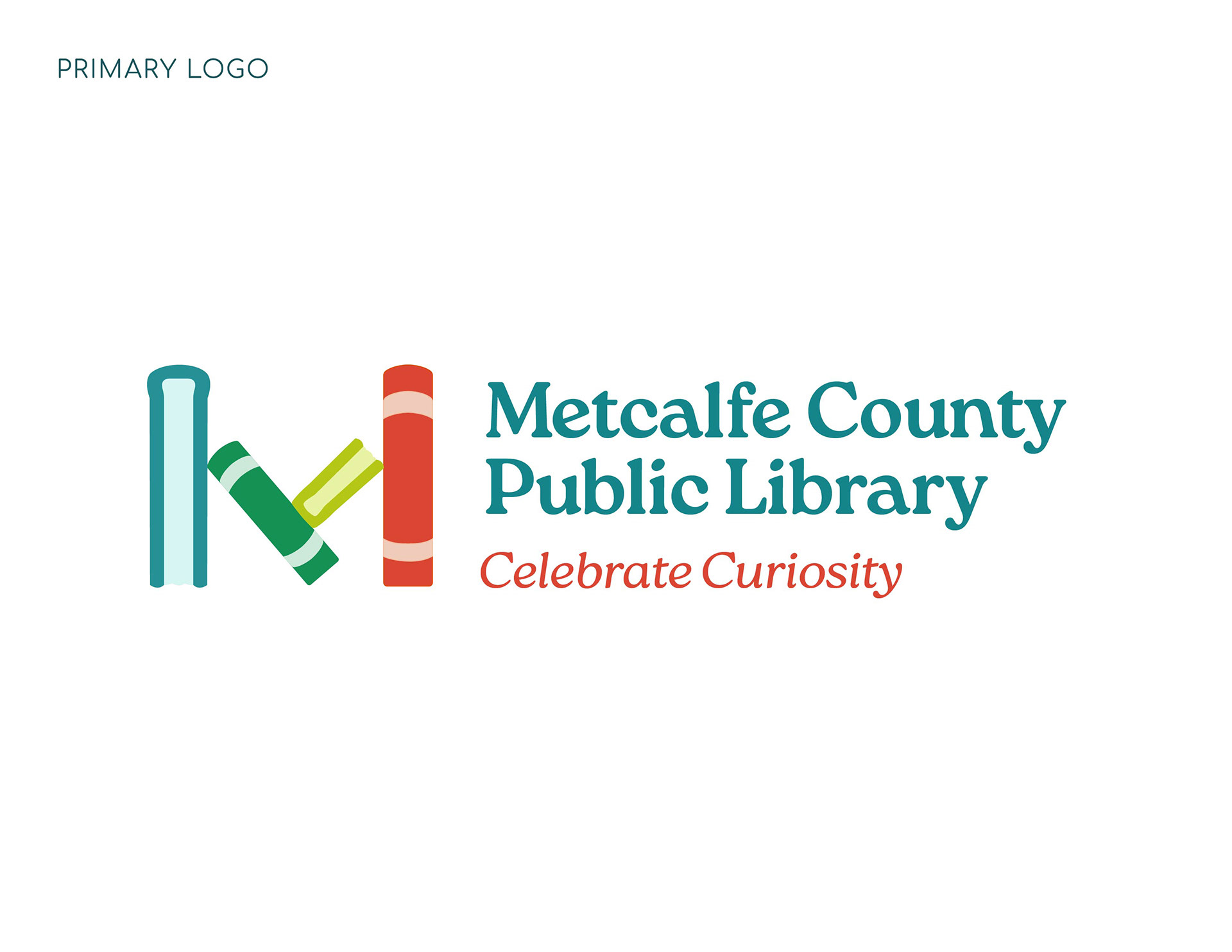

During discovery discussions, the MCPL team showed preference for clean, minimalist logos with a story or hidden message to find. They gravitate toward bright, fun and playful colors.
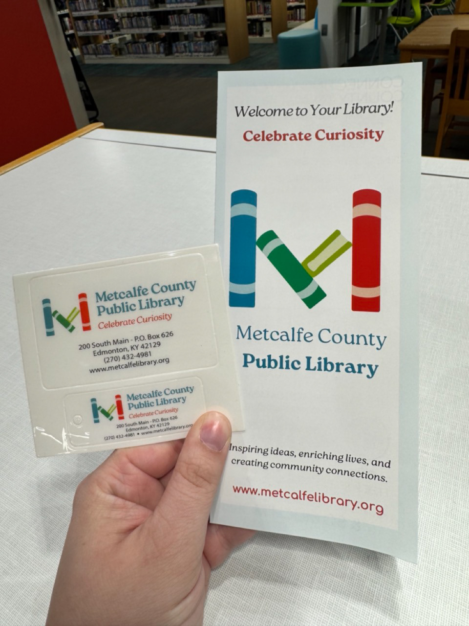
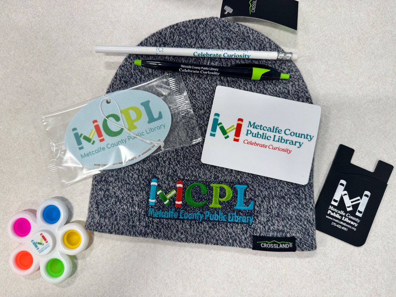
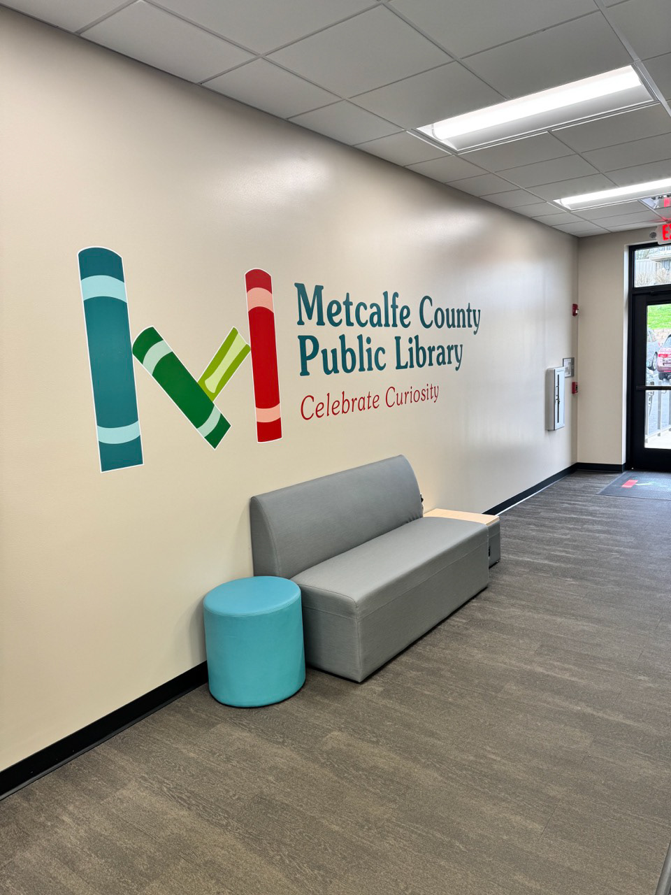
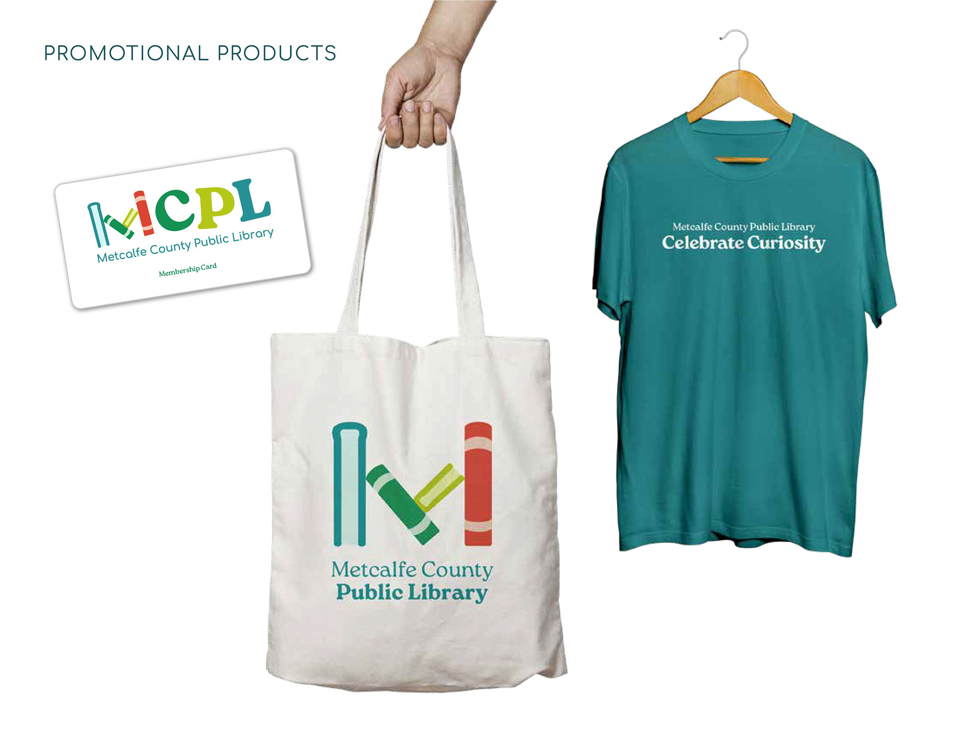
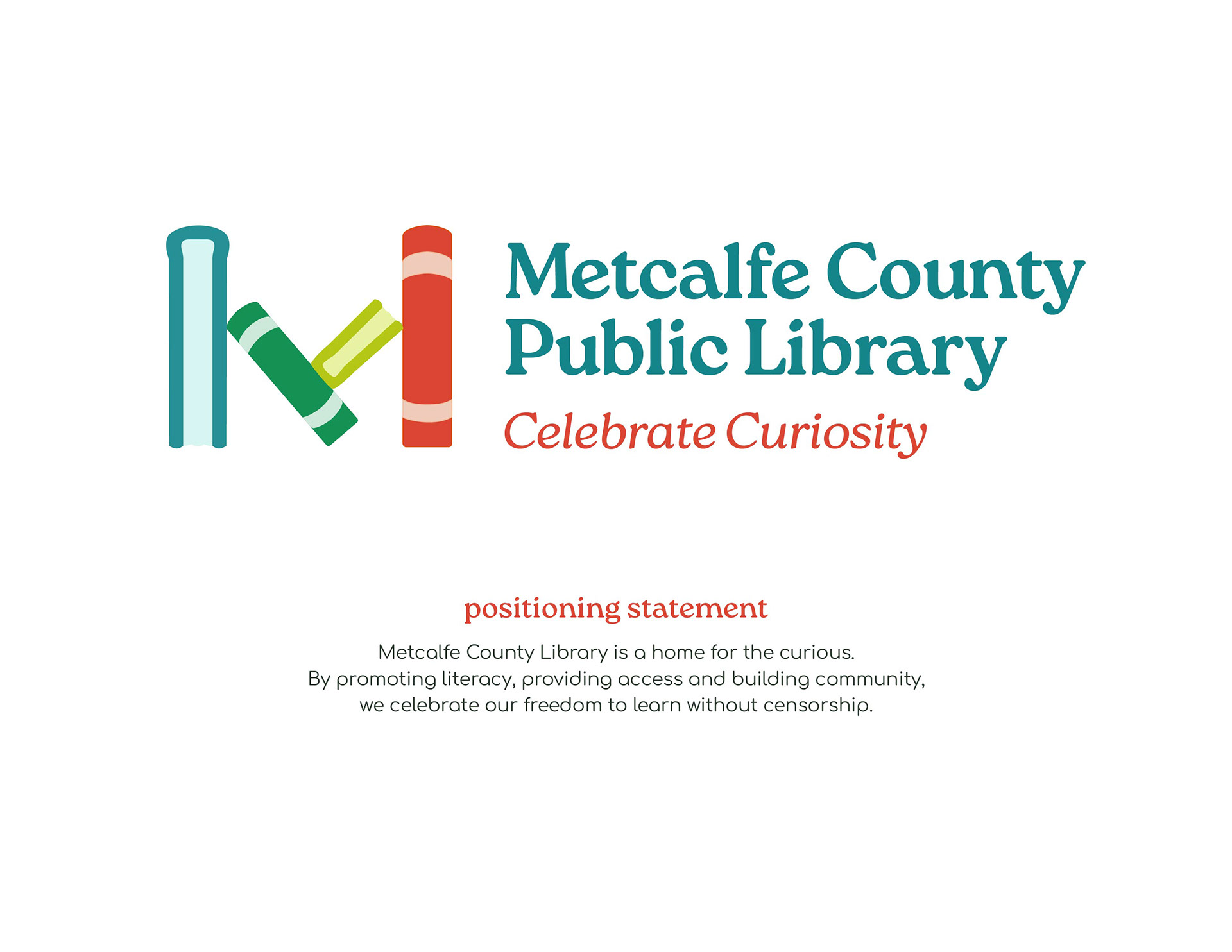
The final logo is representative of the Library and of Metcalfe County. Stacked books create the 'M' emblem– representing the stability and growth that knowledge brings. The shape is identifiable and replicable on purpose.
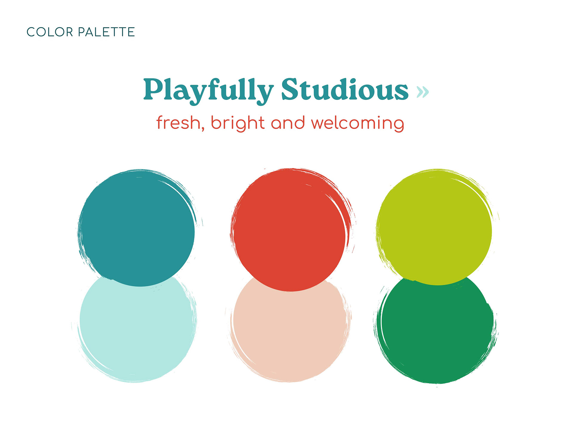
The playfully studious color palette communicates deeper meaning aligned with the mission of MCPL. Teal creates an especially calm presence, aligning with the welcoming environment at MCPL. Green represents growth and abundance. Orange inspires energy and creativity.

I acted as lead designer for Metcalfe County Public Library while employed at P&P Creative.
Check out MCPL here.