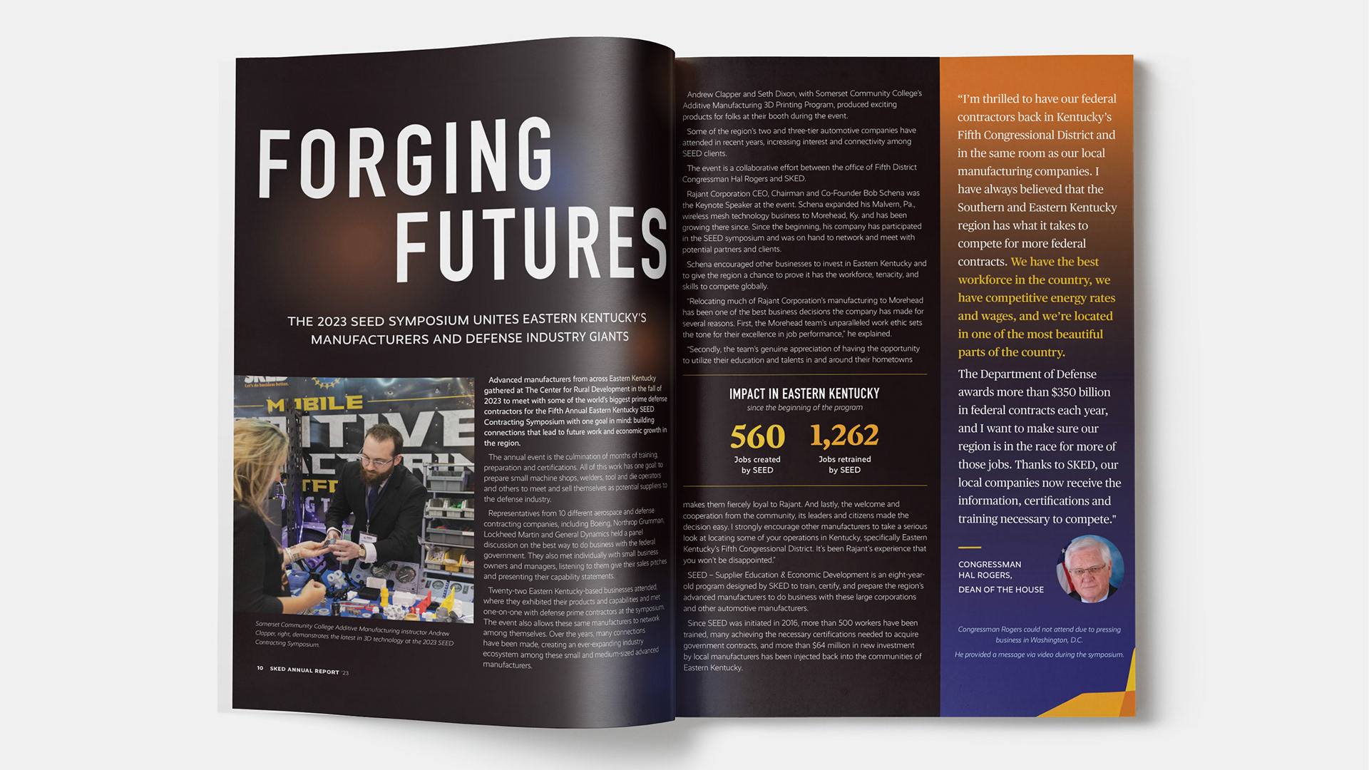
The goal:
Union Church is a historic abolitionist church in Berea, Kentucky known for their inclusive congregation and community outreach.
Church leaders wanted a brand, website and social media presence that clearly communicates their core values to visitors and long-time members alike.
The brand also needed to align with their new "Love Demands" tagline.
What I delivered:
Brand identity, logo marks, business cards, stationery and invite cards, social media templates and a new Wordpress website design framework
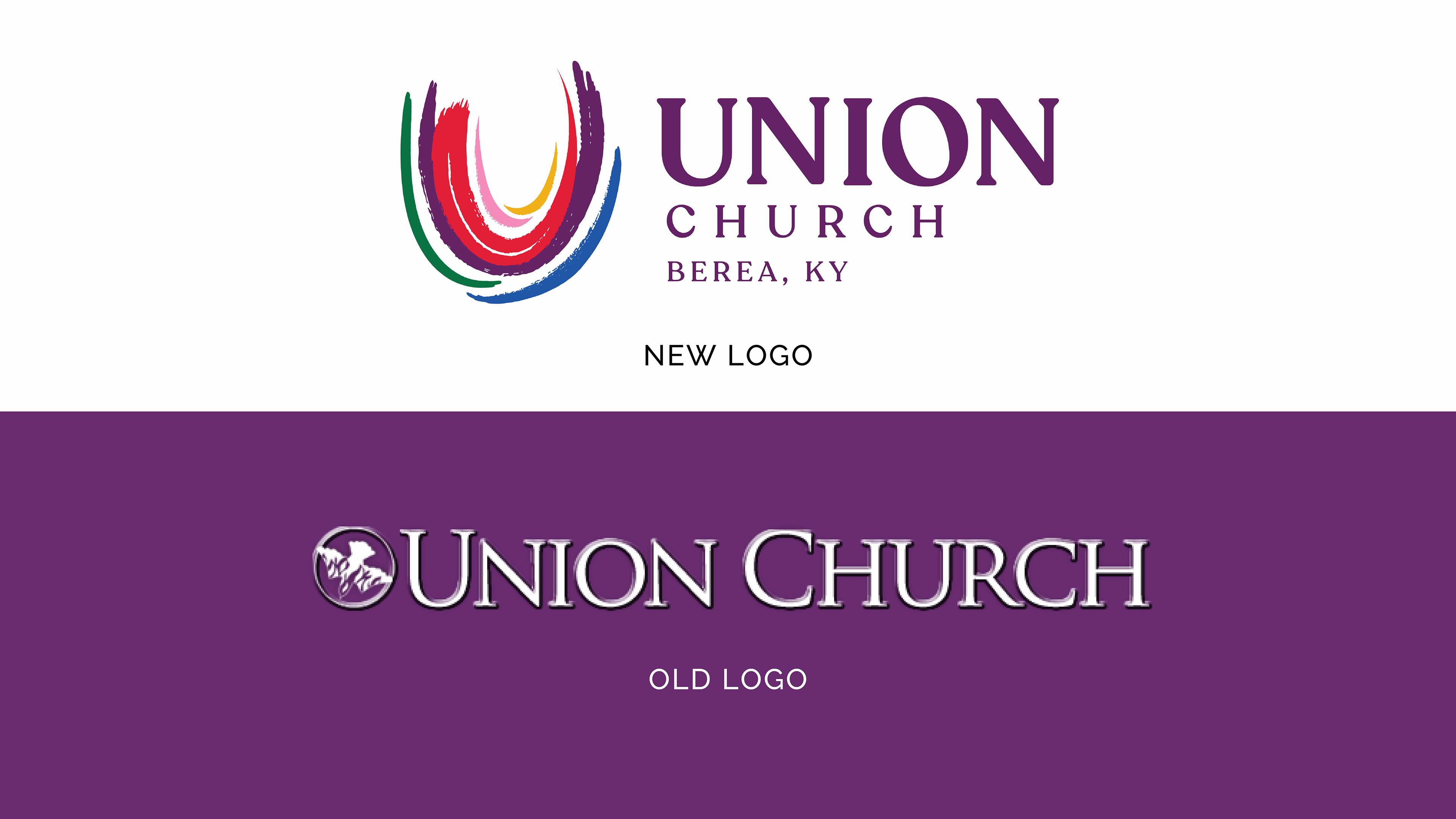
Old logo / new logo comparison
The creative process:
Anyone who visits Union Church knows it's not your typical sanctuary. Here's how they describe themselves:
"We do not believe in conformity. In fact, we believe love demands diversity and rejoices in it. You will not be told what to believe or how to act, and the only expectations we have are that you be true to yourself and your values, and that you speak and act in love."

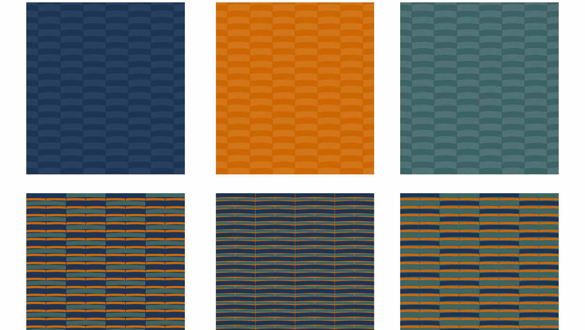
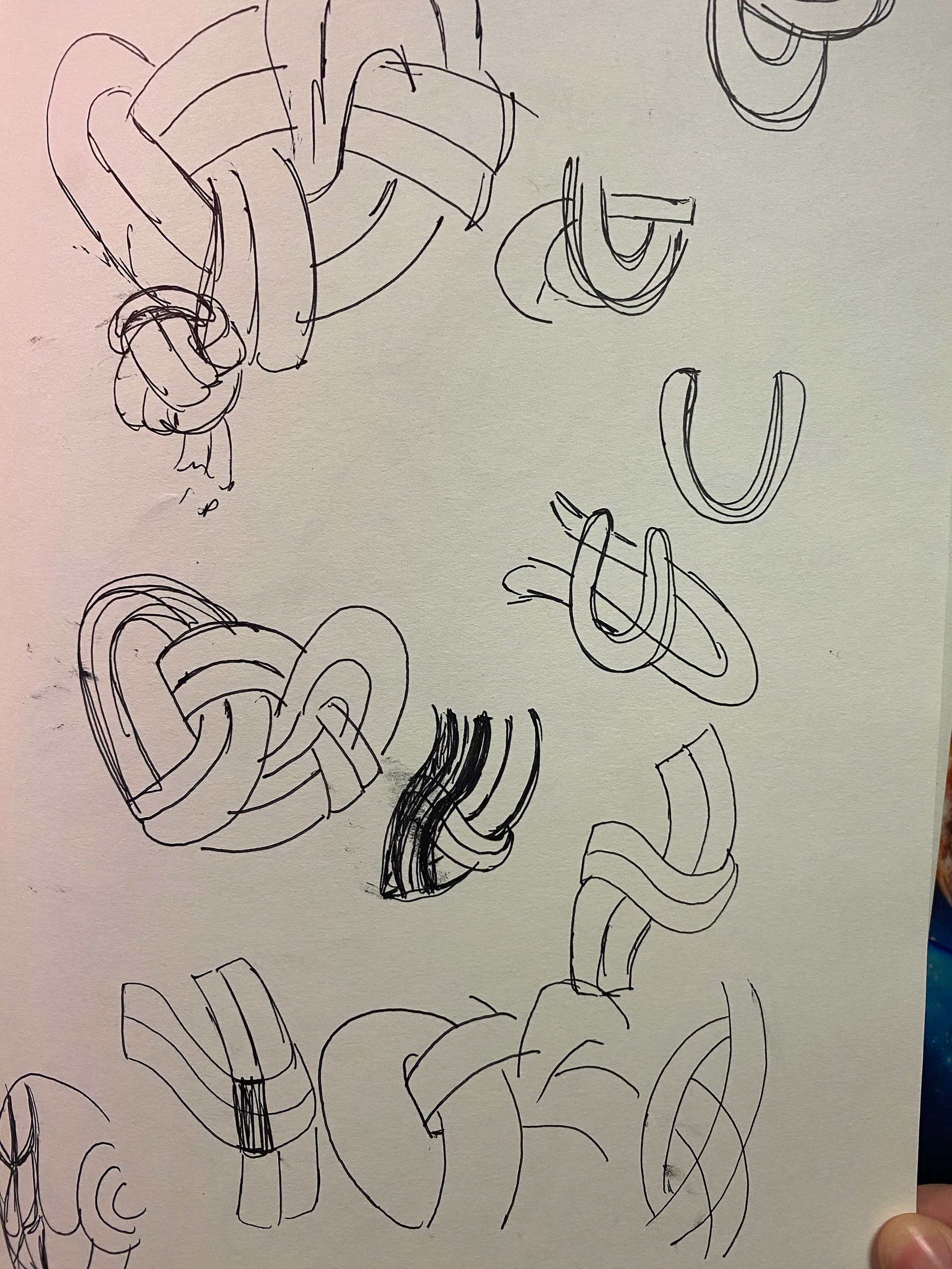
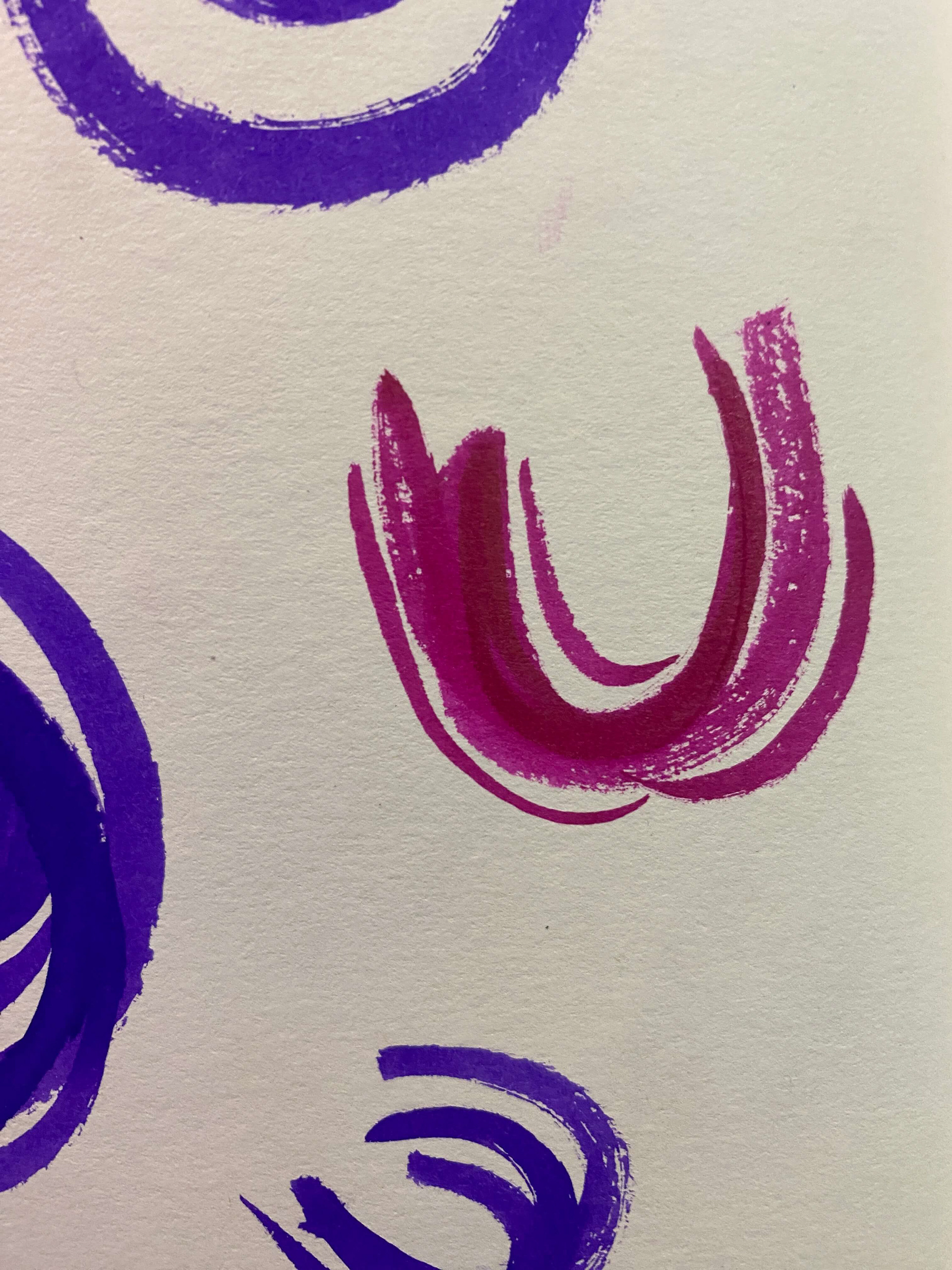
To start, I explored interconnected elements to illustrate the woven nature of Union's congregation. Much like quilted fabric, their community is comprised of people from diverse backgrounds who choose to worship together in celebration of their differences. In those differences, they find commonality and strength.
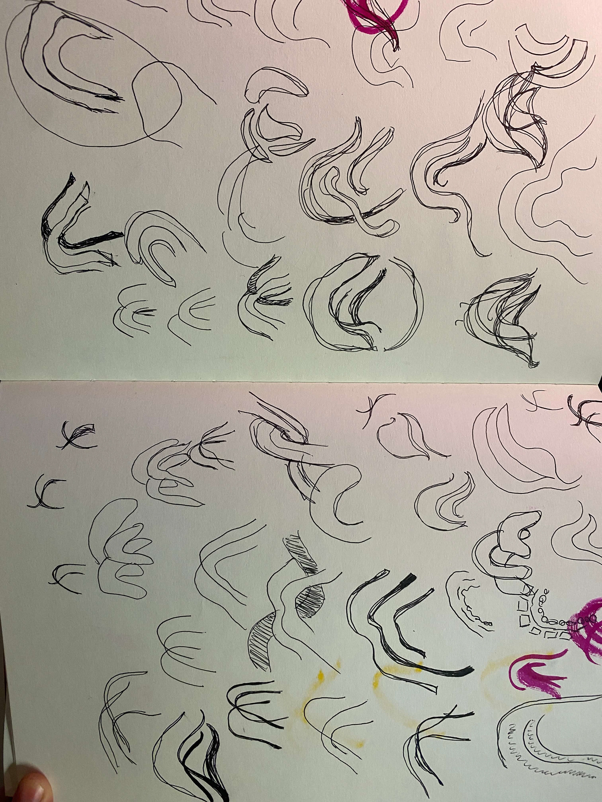
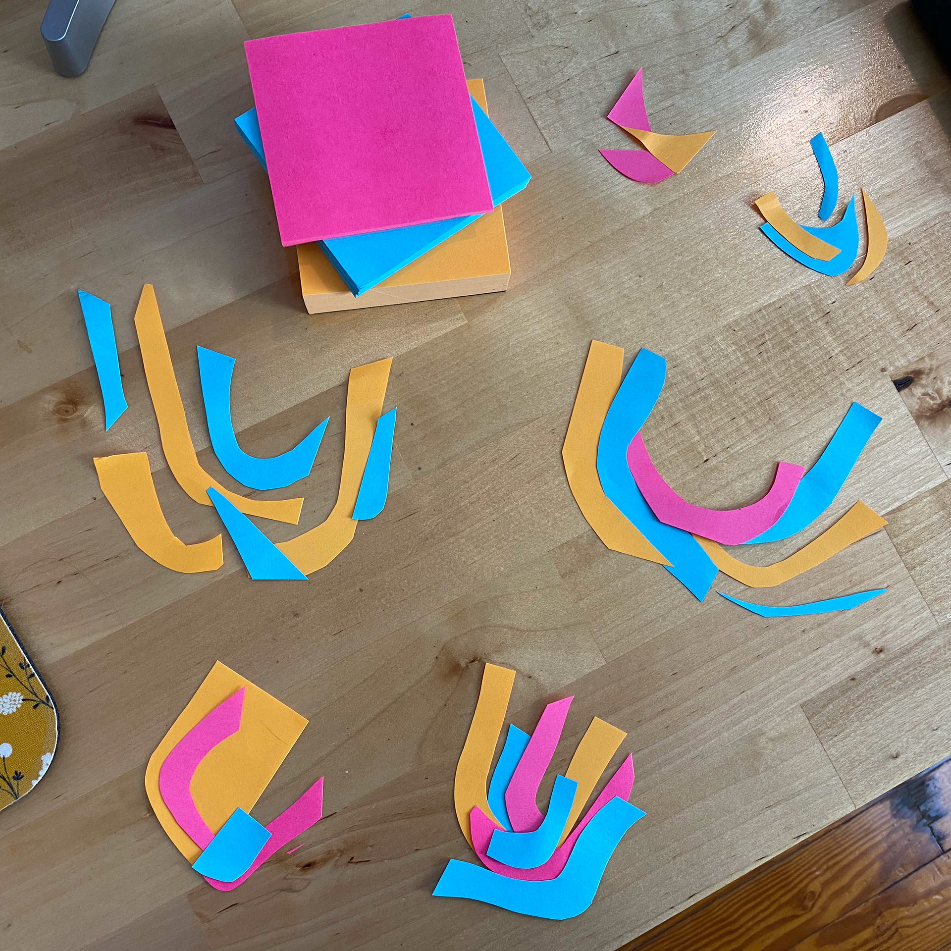
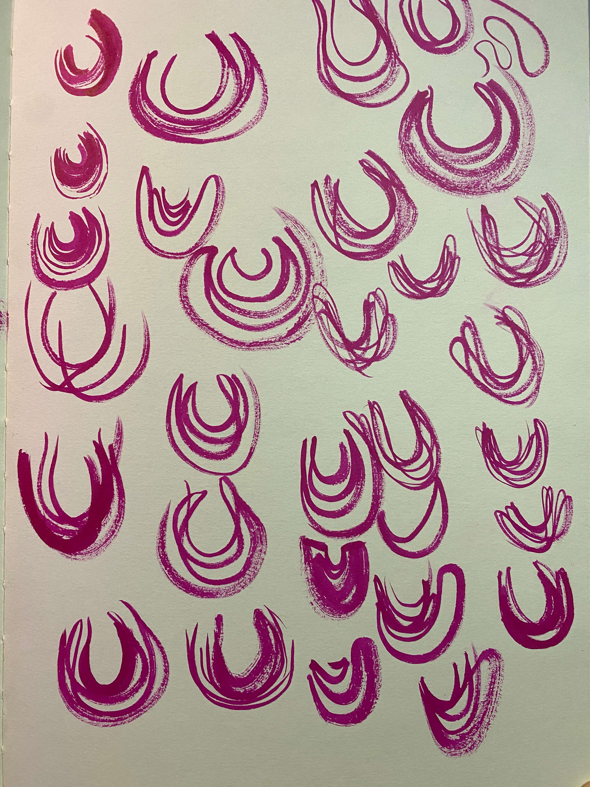
While it's necessary to communicate this core theme, the tight links felt too rigid. Union is all about flow. Movement. Welcoming all at all times. I moved toward abstract organic shapes, and at one point layered pieces of paper to get the overlaps just right.
Ultimately, the Union "U" was born from overlapping lines of varying thickness, definition and length, all gently coming together to create an identifiable mark.

The deliverables:
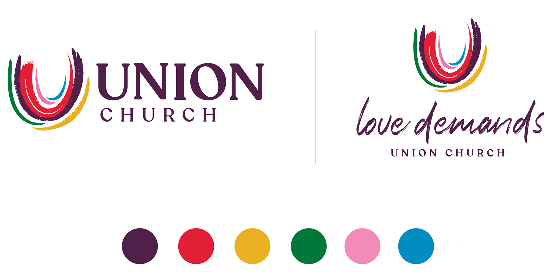
Primary horizontal logo, stacked duel Love Demands/Union mark and color palette

Logo variations: Union (stacked), Love Demands (stacked) and icon

Zoom backgrounds and social media templates
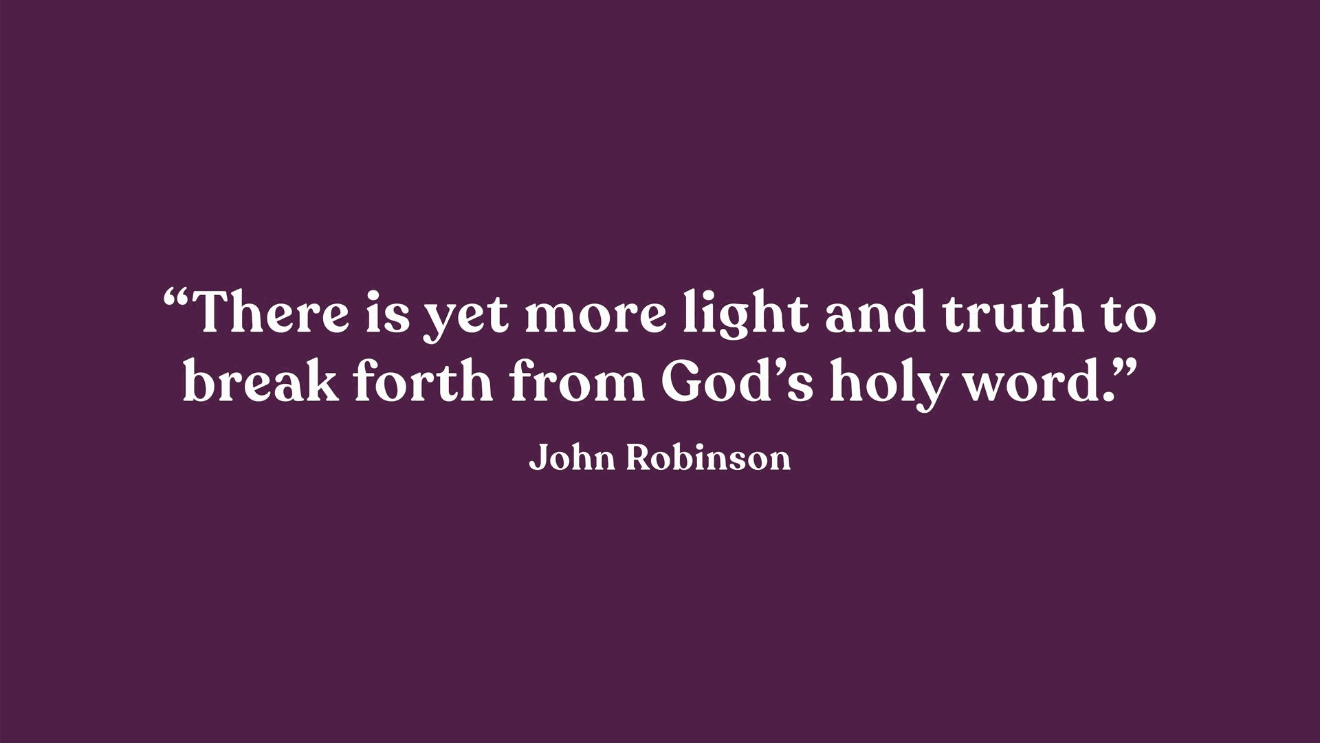
Inspirational quotes
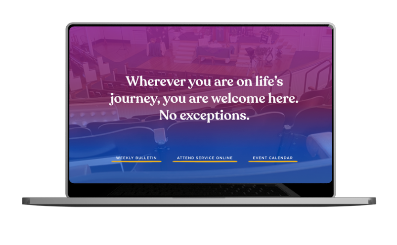
View site at www.union-church.org
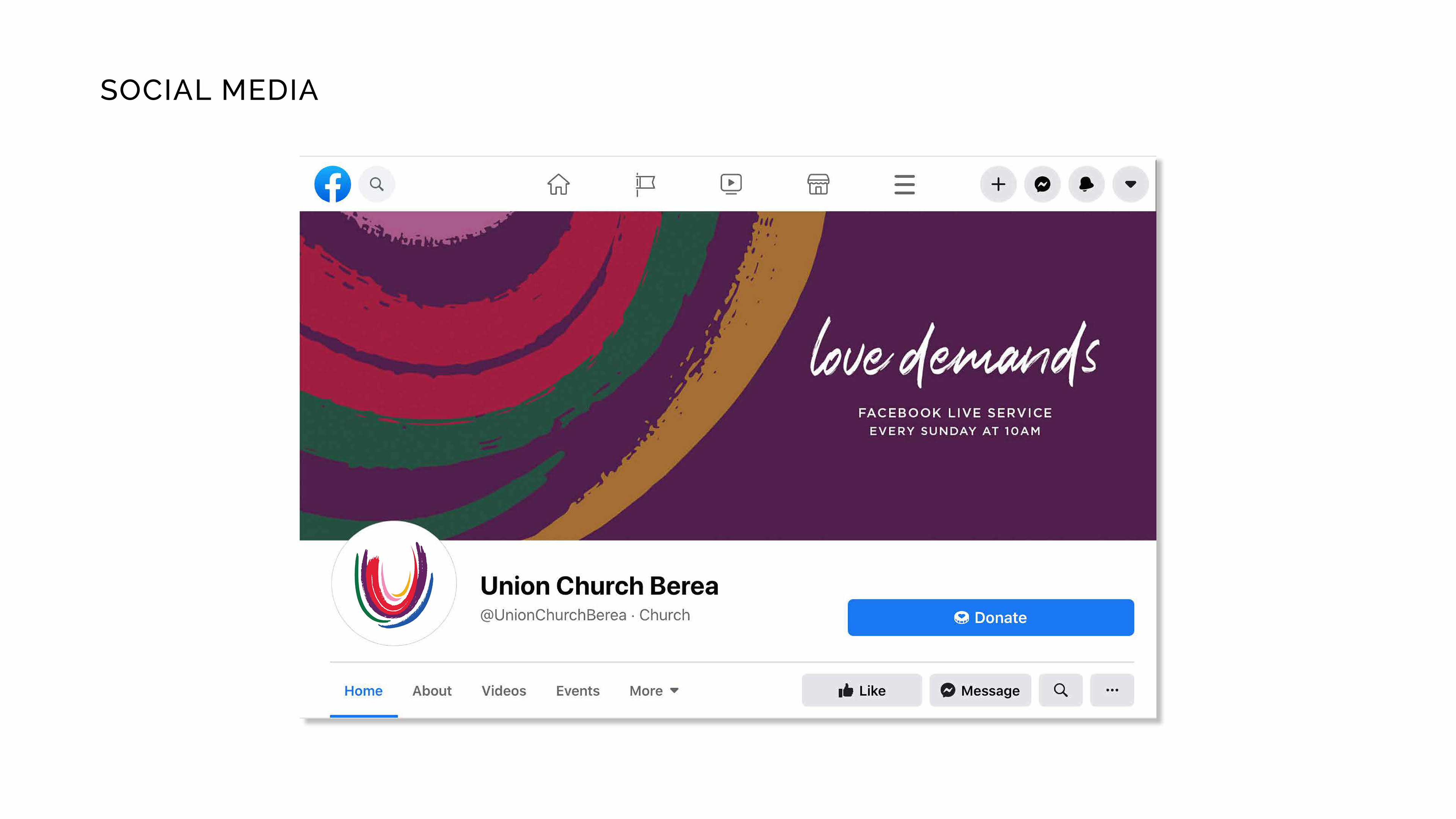
Facebook profile photo and cover image
The results:

Me standing in front of Union Church in 2025 – four years after their rebrand.
"I thought the process was well done, thorough and ended in a logo that we love, use and have received compliments on. It has become us in a nutshell. I'd never really thought about how it reflects on the vision, but I do think it does. It is colorful, bold, open and inclusive. We rely on the logo and use it shamelessly."
- Dave Kobersmith, Church Administrator
Union Church